
Topic of digital printing can be a bit complicated. For start we don’t see (or rather process) colours in the same way – remember black and blue, or white and gold dress from 2015 phenomenon ? Next, we look at digital art on different monitors and this will affect our perception. And finally print quality depends on the device we print (home printer, print shop), medium (paper/canva quality), ink, and even printing company (some do better job than the others).
A small note: A1 can be printed out of original A3 – I use professional scanner and scan art in 1600dpi (takes ages but gives awesome results)
Let’s see some examples.
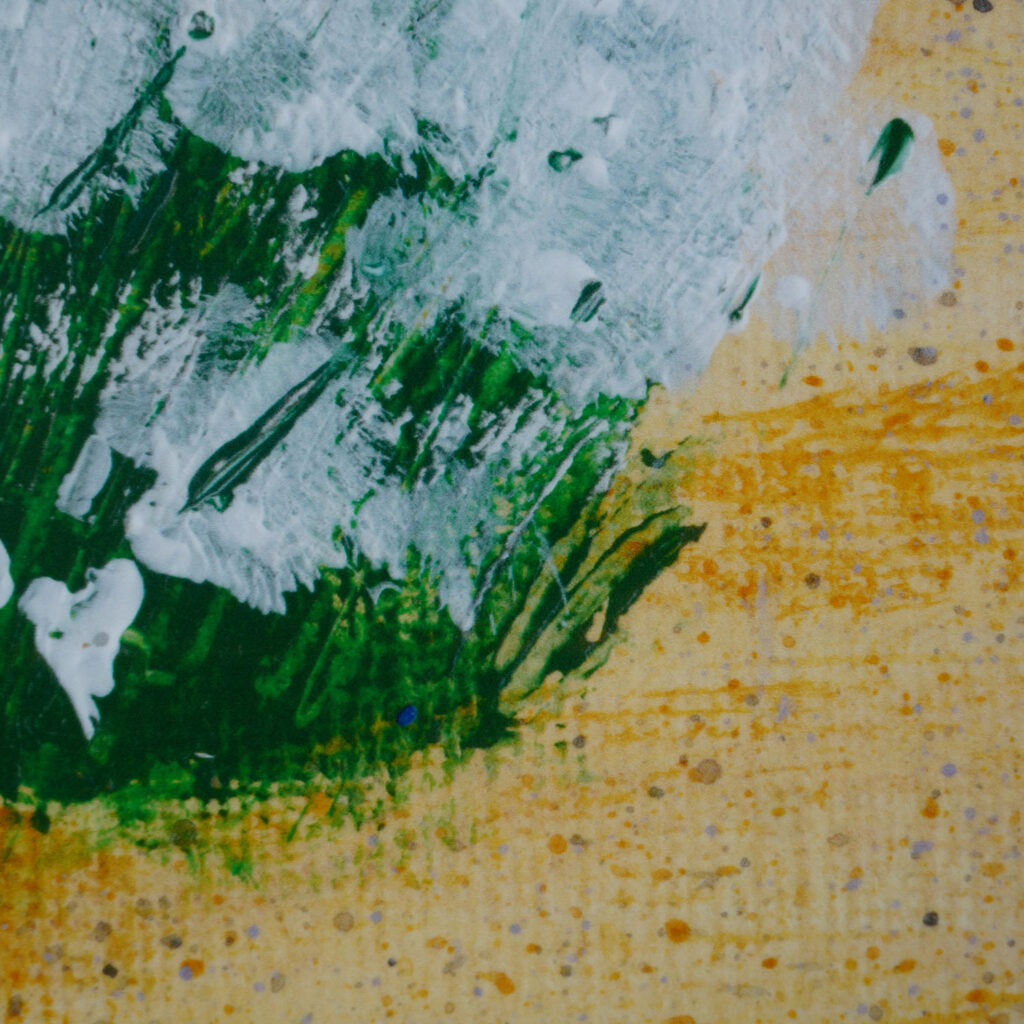
Sea kale from this post. Printed in A1 format on 180gsm white plain paper. On the wall original painting in A3.
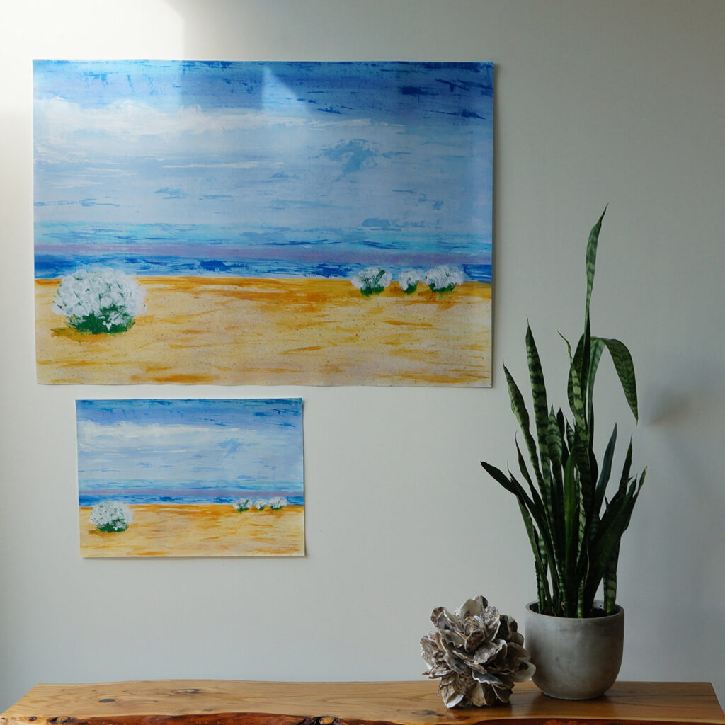
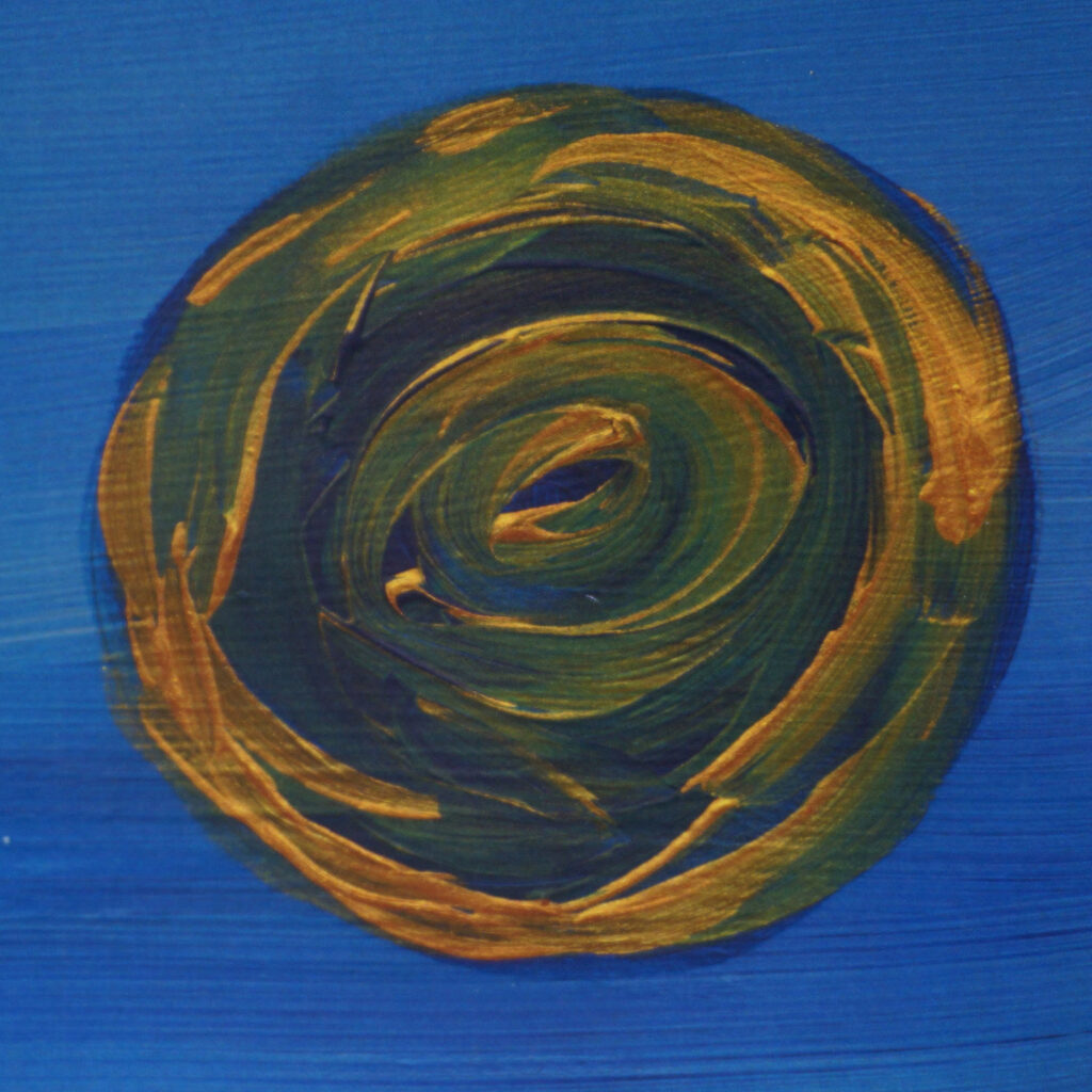
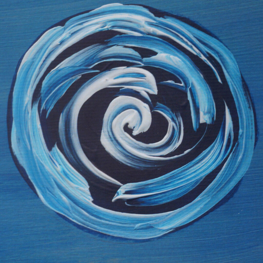
Details of the print:

Two prints created from the same file, on the same paper. Colours are slightly different – person in print shop was making manual colour matching (or not) or maybe a problem with a printing machine?
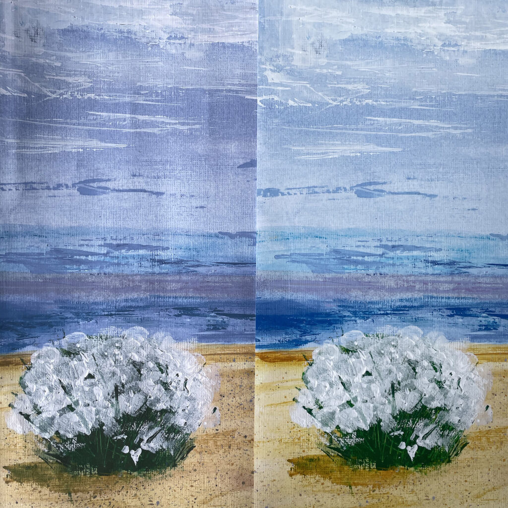
Anyway, results are great.
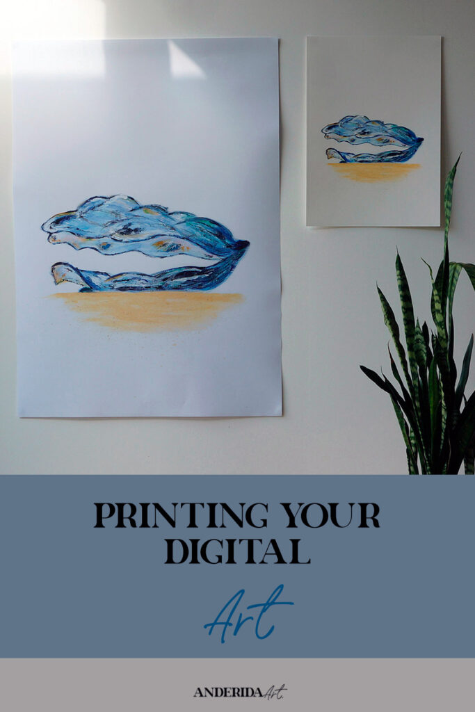
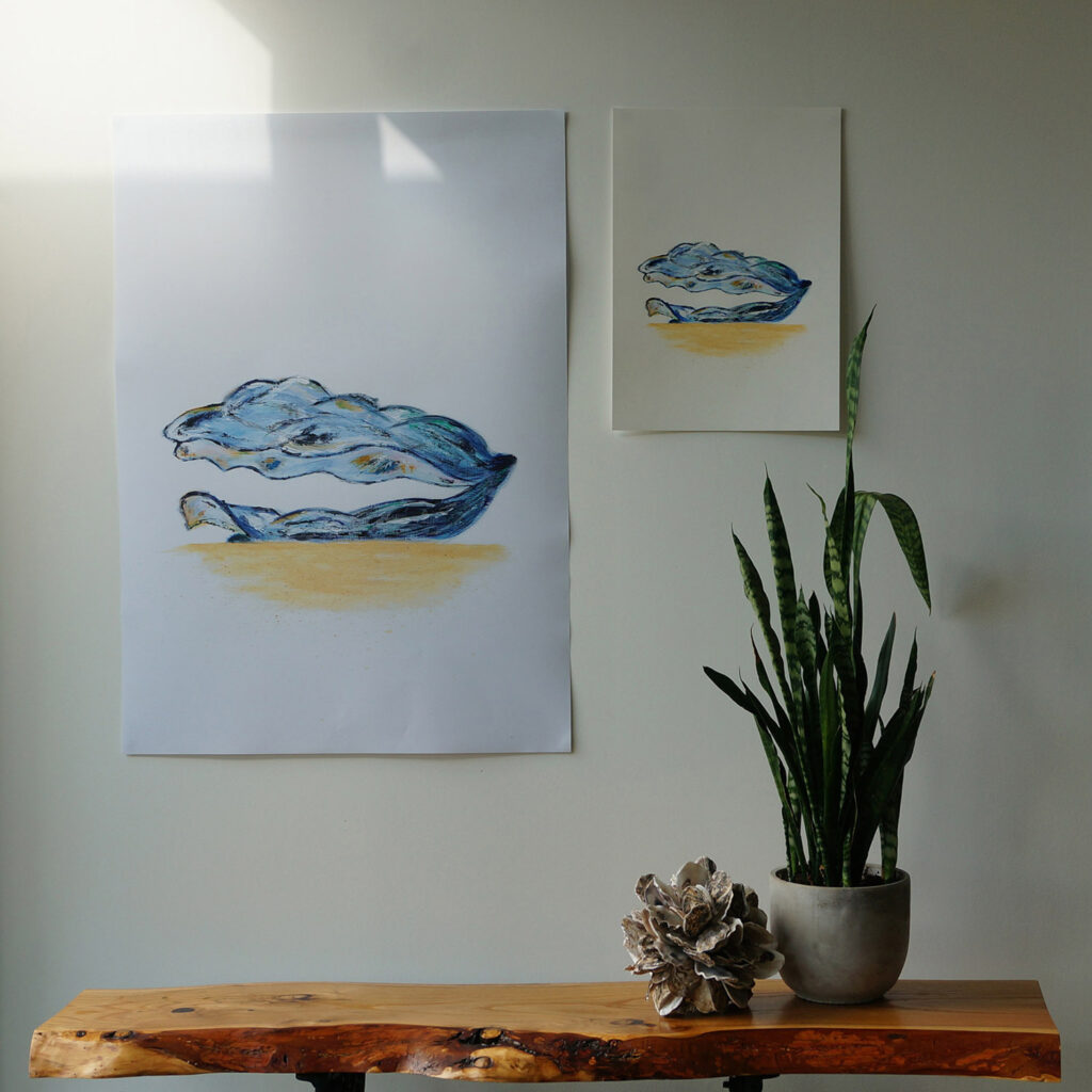
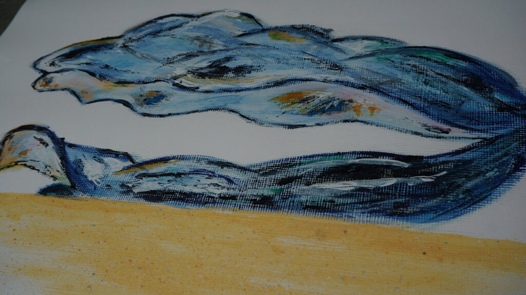
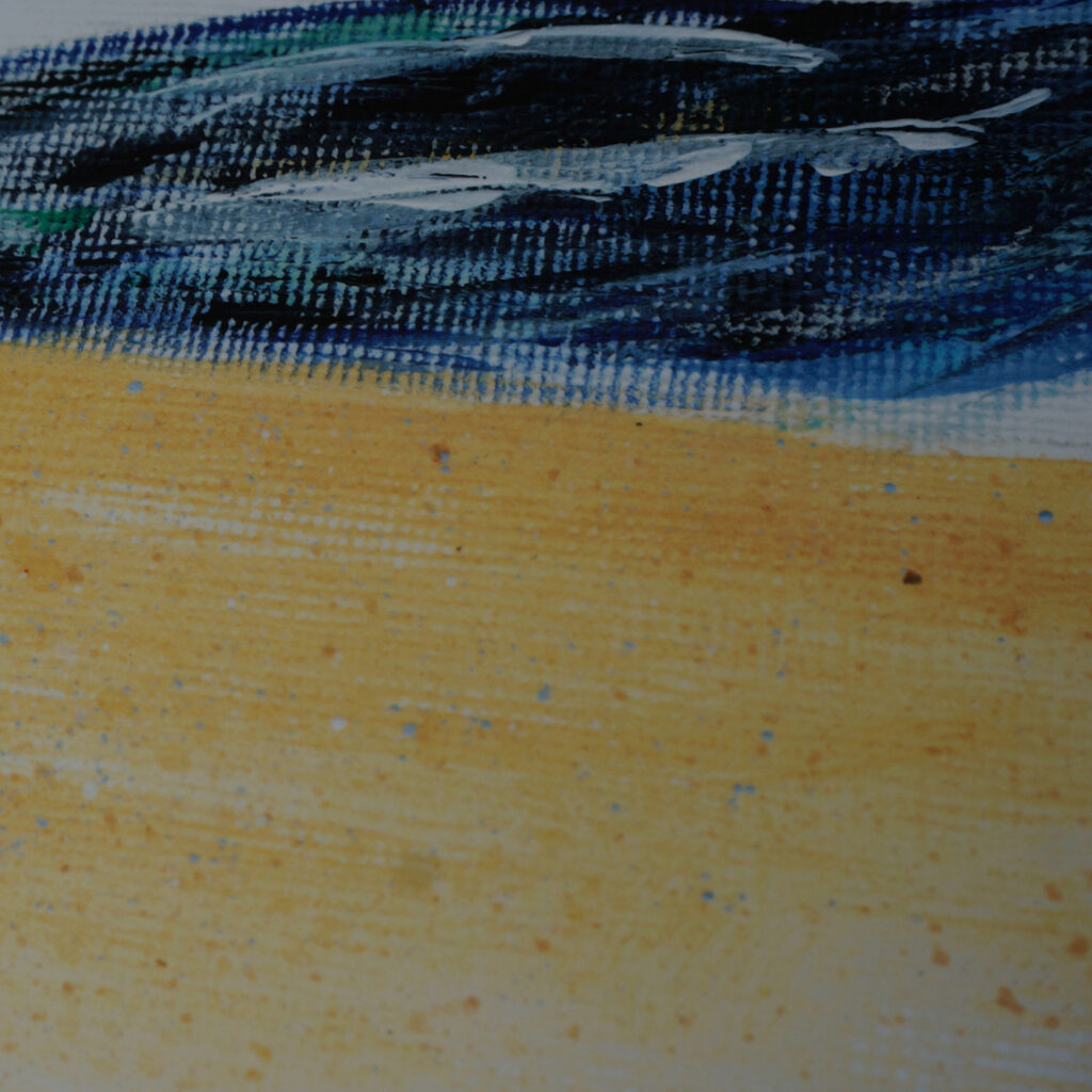
Oyster shell. Printed in A1 format on 190gsm white satin photo paper. On the wall original painting in A3.
Details
As you can see, better paper quality gives oomph.
I also wanted to see how reflective paint (silver, gold) looks in print. I used this (unfortunately original painting had an accident after scanning and I couldn’t put it next to print):
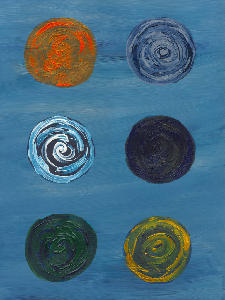
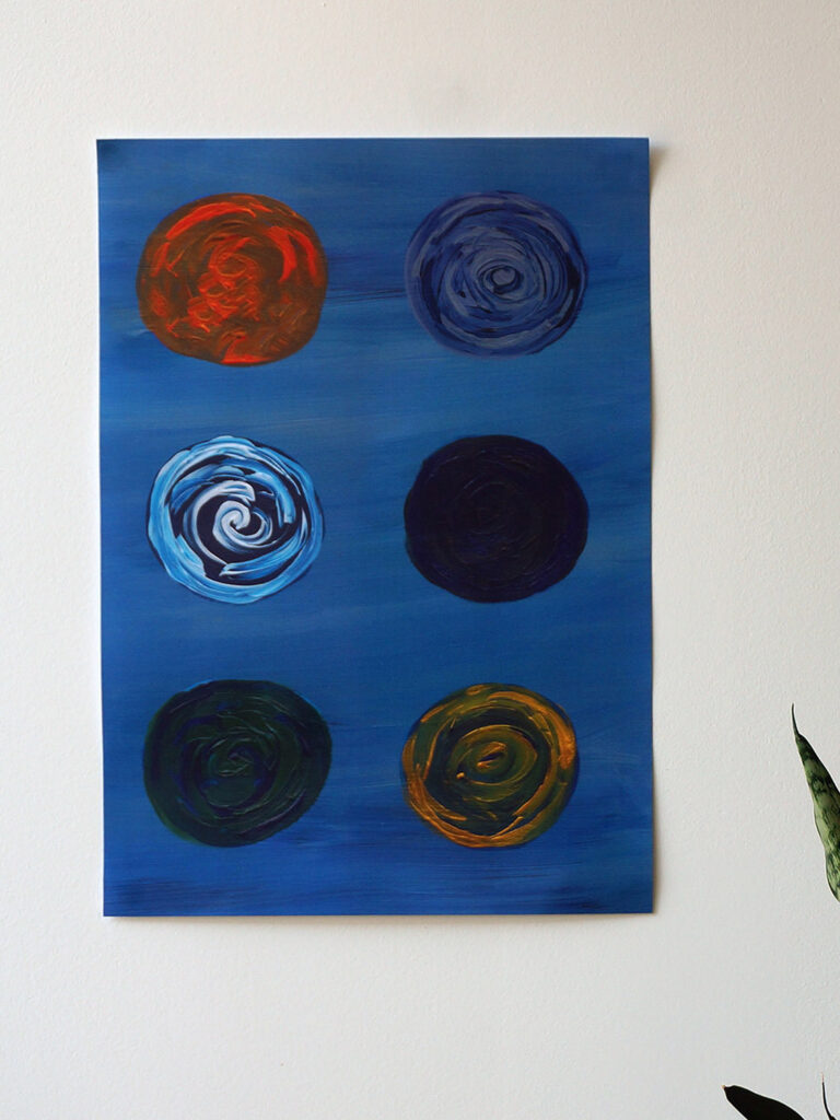
Printed on A3 160gsm white plain paper. Details below. A bit darker than iriginal but still pretty good.
Overall, digital prints are a great way to get art you love in a reasonable price, and great flexibility – you can decide what format you want, if you want paper or canvas, etc.
If you like any of them here are links to my Etsy shop: